The Product - Version 1
What is Admixtures?
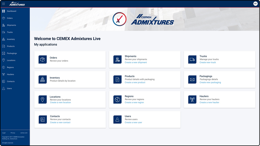
Internally called The Mortars App, this web application is a B2B platform which serves CEMEX internal staff (ex.: dispatchers), external collaborators (ex.: contracted hauliers) and customers.
It was established as a regional project, complementing other global initiatives, but tailored to better comply with rules, standards and regulations across the European region: UK, France, Germany and Poland.
One of the core features of the platform was it’s modular architecture in regards to roles - entities - scope. One user would have only one role assigned, while the scope defines the entities which apply to that specific role. Here are some examples of entities: orders, shipments, trucks, inventory, locations, contacts, users.
How it started
What I was Tasked "TO DO"
When I joined the project, version 1 was already released.
Further work was required for the second release version. The main assignments I got from the client was to help external designer and technical team to better align with the company’s design language system, as well as to work with the business unit from UK in extending the solution.
During the kick-off meeting with the UK business unit, I understood few things that helped me formulate the problem statement:

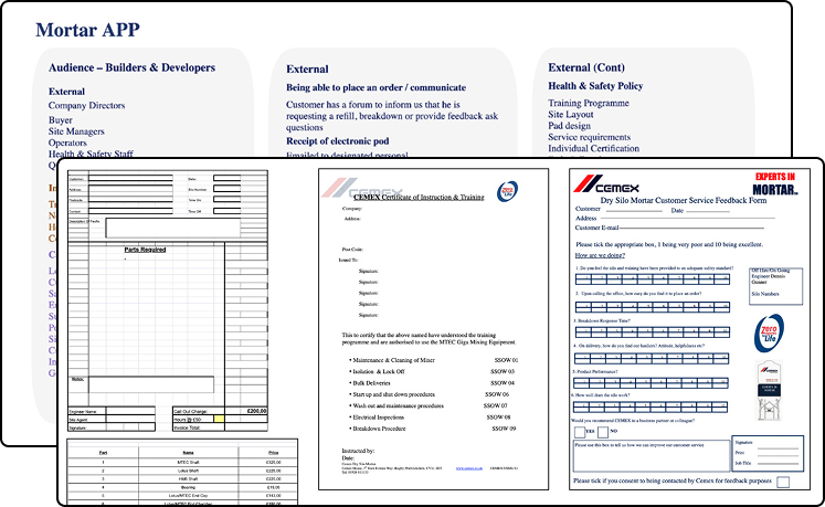
Collected Artifacts
The Problem Statement
How can I make it possible for CEMEX...
to better support their customers with access to business rules, best practices, industry news, manuals and trainings - all leading to a more cost-effective and safe handling of the leased equipment ...
AND to anticipate the customers needs through better feedback communication channels.
Getting Things Right
Aligning with The Business Scenarios
To make sure I did not miss any critical parts, I drafted the user stories, framed them from the main actors point of view and I illustrated the associated scenarios.
Those became useful in upcoming business calls and when I moved into sketching and wireframing.
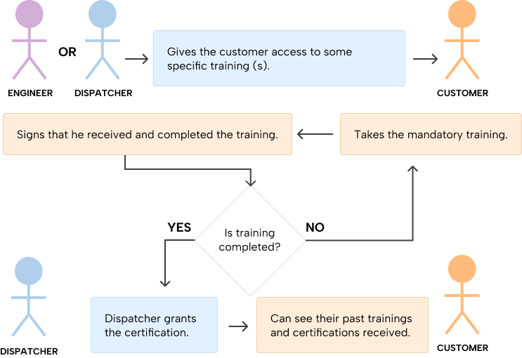
As a customer I want to get trained and I want to obtain my certification, in order to properly operate and maintain the dry silo equipment.
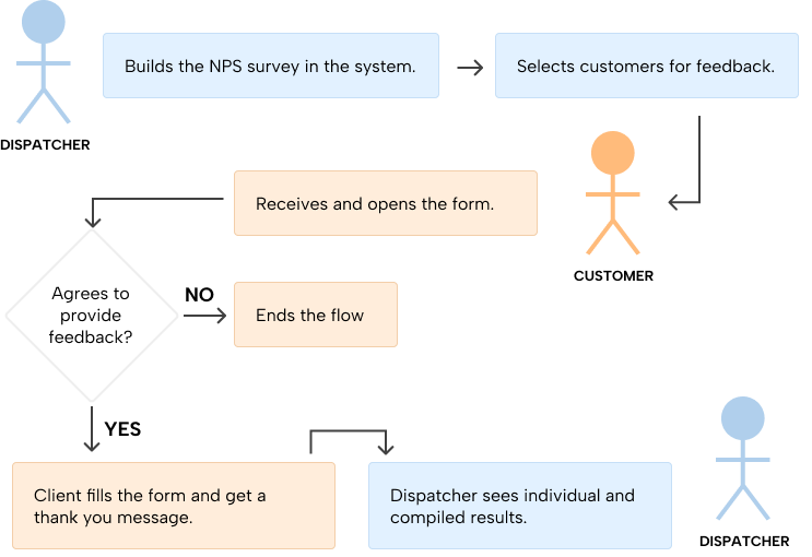
As a dispatcher from CEMEX, I want to receive customer's feedback (NPS / CSAT), in order to improve the service quality.
As a customer I want to easily fix and proper maintain the equipment received from CEMEX in order to avoid downtime and reduce the maintenance costs.

As a customer I want to be able to provide feedback, ask questions or formulate a complain to CEMEX staff.

WIREFRAMES
“This Looks Good, but Please Add a Bit of Colour”
This section gives an overview on the amount of wireframes generated after having an agreement with the Business Unit on the scenarios above. It’s a raw and unfiltered view of how this project looked behind the scenes.


The reason I chose this approach was based on previous experience working for the client and my expectation of a high volume of screens that would need to be created and rapidly modified from meeting to meeting. Aligning with the business and development team on the functionality the interface is capable to cover it’s a crucial step.
Doubts, observations and comments were added as “post-its” to increase visibility. I wanted to give everyone involved a chance to raise concerns and to be heard. Another reason to use those is that when I came across something I could not solve on the spot - it kept me moving forward and it kept the discussion going.


Almost 100 screens were generated in low-fidelity. The big win was getting more feedback early on. When dealing with tight deadlines and high level of uncertainty, I prioritize progress over “getting it perfect”. I just knew it’s time to move to the next stage when the decision makers said “This looks how we envision it, just add a bit more colour”.
High Fidelity Work
Yes to Final Screens — Once The Whole Team is On-Board
Spotting inconsistencies
One of the reasons I actively took part in this project was to help the external designer avoid deviating from the CEMEX official design standards. The released version carried design decisions that miss on the fundamentals.
The largest amount of inconsistencies were driven from two areas:
- the layout level - when the use of a responsive grid system is mis-interpreted or not implemented at all
- the component level - when an UI element is used differently from its initial defined scope or when the same UI element shows or behaves differently across the app
The images contain few cases I came across, while below, you will find additional points I made for the debriefing of the technical team.


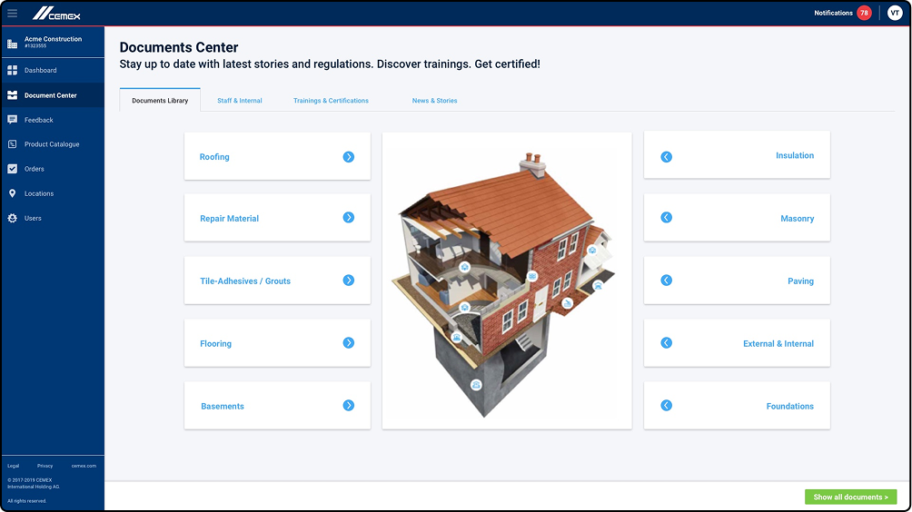
Key Screens Deliverables
With stricter UI rules and by relaying on the Sketch - UI Components Library - I managed to stay consistent and deliver on time the screens depicted in the low-fidelity phase. Here are some examples, for illustration purpose.


Final Thoughts
Conclusions and Lessons Learnt
- What may initially seem like one or two business problems often expands into multiple use cases and screens that require thoughtful design attention.
- Early feedback and team buy-in are critical to a project’s success. It’s essential to create space for everyone involved to share their perspectives and concerns.
- No matter what stage of the project I join, I always look for ways to improve the user experience and enhance the UI.
- In the end, it’s less about “what the designer can do” and more about “what we can accomplish together as a team.” Close alignment with other designers and the technical team always pays off.